Street Address
City, State, Zip
Phone Number
No good idea goes to waste
Your Custom Text Here
VISUAL DESIGN
Print and web for a consumer-facing text
PROBLEM:
Produce a formal report as a booklet and website for two different stakeholders on the subject of industrial ecology for a client of your choice. Design the layout, information architecture, grid system, typography, images, color, and tone of voice for the report (Interaction Design Fundamentals, Fall 2014).
SOLUTION:
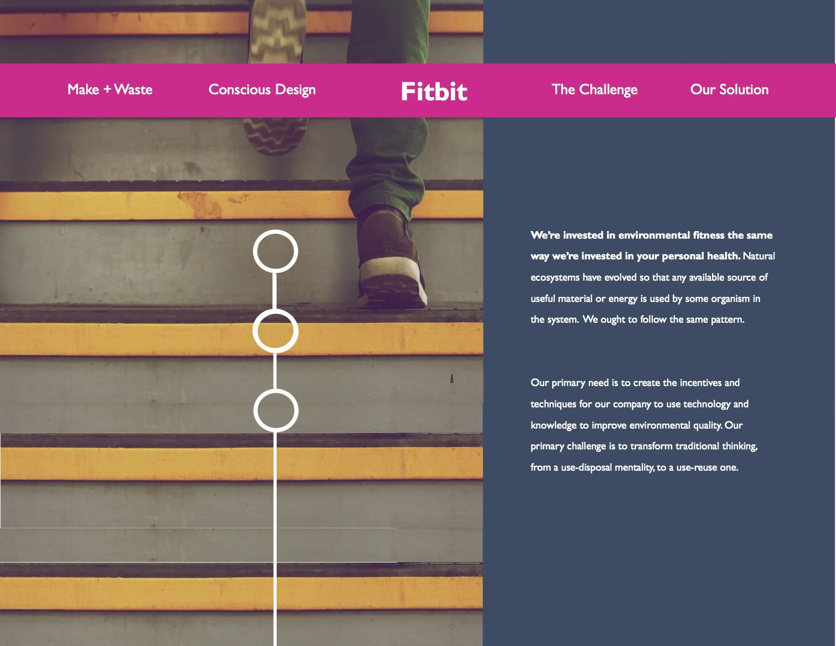
Content adapted for print and web to meet the needs of two audiences: Fitbit's Board of Directors and customers.
PROCESS:
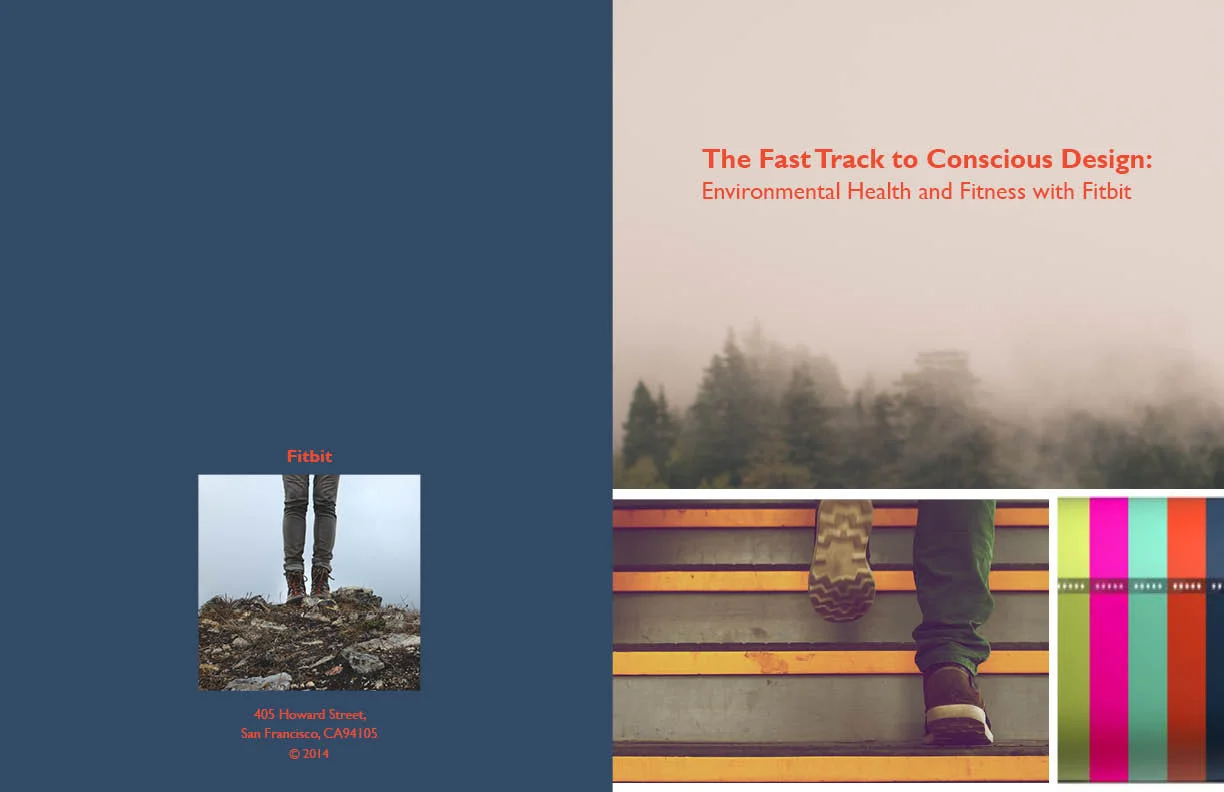
It all starts with the text. I began this process by editing the body of the paper (author, currently unidentified) and inserting headlines, callouts, and introductory text to make it more suitable to the two audiences. It was important to give the Board a direct, to-the-point book that they could flip through and begin on any page. I focused on making the argument that positive industrial habits are in keeping with the brand's identity of conscientious living, and reduce costs in the long run. Recent in FitBit's memory too would be the recall in 2013, and they would have to make amends. For the educated, self-aware consumer that Fitbit markets to, I wanted to provide that consumer who is interested in his physical health the opportunity to learn about the environment, a likely interest of his already.
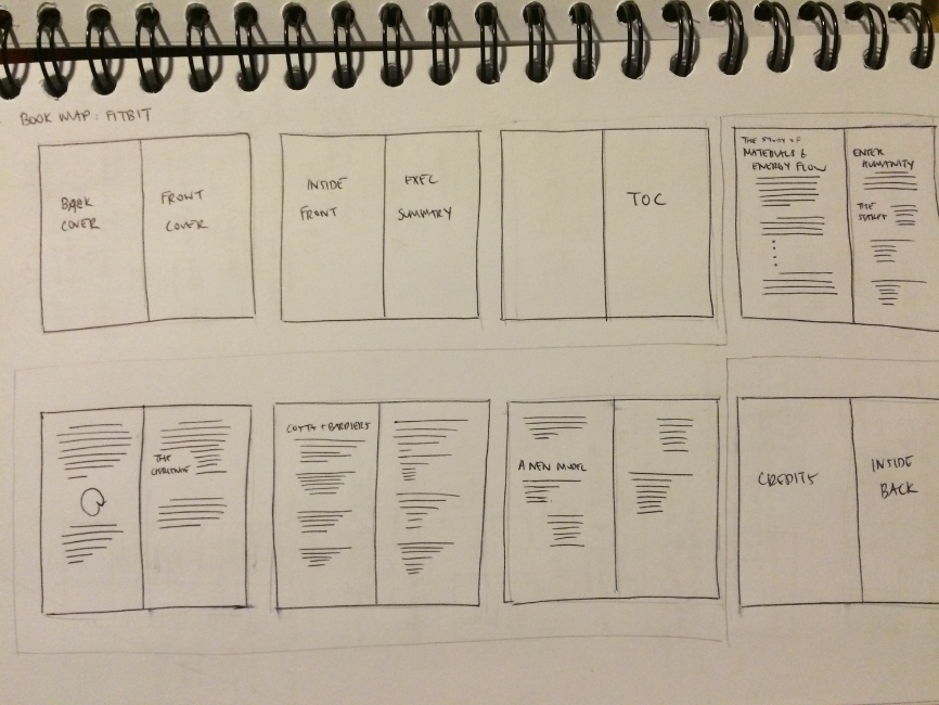
I created a hierarchy from the headings to the subheadings to the texts and captions by varying the font size and color, and I played with the concept of "monitoring" for the language and the infographic. As part of the process, we drew thumbnails to determine the structure of the book, worked with a grid, slowly added complexity to the page layouts, carefully selected images and typography, and applied systems thinking across multiple pages.
Overall, I wanted to tell a story through the images and the words, and a goal-oriented one, in keeping with Fitbit's brand voice.
Skills employed:
- Print and Web Design
- Interaction Design
- Visual Design (Adobe InDesign/Illustrator)
- Copywriting
- Data Visualization


Because the web version was developed to be circulated internally inside Fitbit, for those who wanted a second look, or to know more, it had to link to all the existing content in the book. Concision and information architecture were areas of emphasis for the home page. The section headings were rewritten for the nav bar to be even snappier.